Royal Match vs Royal Kingdom
Dream Games has released a new (and oddly familiar) game and it’s worth talking about.
Royal Match and Royal Kingdom have similar mechanics- match 3 games with familiar obstacles and boosters
Identical narratives- collecting resources to help a king restore his palace/kingdom
The same primary leaning palette
And, often, identical layouts
But before we get upset and assume it’s just another game clone, let’s talk about what they did change in the UI in their latest release and the impact of those changes. I’ve gathered a few screenshots of various features from both games to compare the 2 side by side and I’d like to do that through a few specific lenses: contrast, hierarchy, and color.
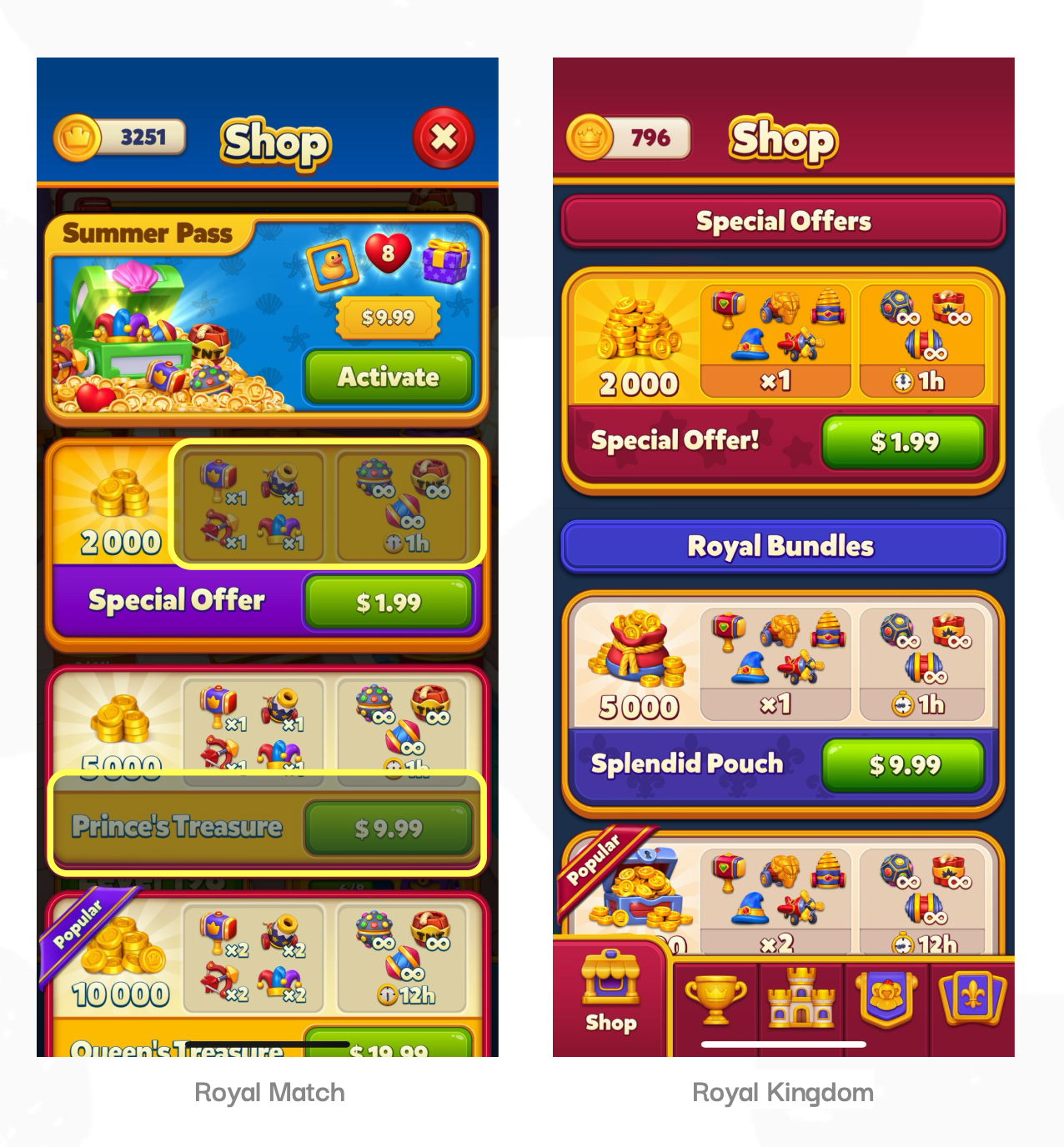
Shop UI Changes
The updates to the shop here change the overall look pretty significantly. I love the more intentional use of color here to create a visual hierarchy that makes it easier to digest the information. Each type of shop bundle is color-coded and organized under a header banner of that color, which makes them easy to identify and will, potentially, allow them to advertise multiple bundles of each category in the future. And they have also simplified the color palette, reducing it down to primary colors- the purples removed almost entirely. This has helped reduce visual noise and make everything look more cohesive
I’m of 2 minds on the numerical change of the actual boosters. If you take a look at the items within the top bundle, in the newest version they have placed the amount of each booster below all of the included boosters rather than on each icon. This does make for a cleaner read and allows the icons to be larger but this also seems limiting from a product side as they would have to give the same quantity of each item

Card Album UI Changes
I love Royal Kingdom’s approach to the main Card Album layout. Visually overall I find it more appealing.
A few minor changes I noticed right away with the info and duplicate card buttons up top were the addition of that gold, beveled outer stroke. This really helps make those look more tapable and helps them stand out from the busy bg.
The backing of the small progression bars beneath the set icons are darker and this really helps push them back in the space, better emphasizing the set rewards and creating greater depth in the composition.
The header is more successful in this update, it has much better contrast- that bold red color helps both the title and the grand prize (what the players are working towards) stand out.
The use of hexagons for the set icons is a wonderful use of shape to create contrast because that shape isn’t used anywhere else, visual interest and an element of playfulness. The images within the set icons have also been scaled up so there is a lot less weird negative space and their overall legibility is improved.

Battle Pass UI Changes
Contrast is what I would say is the most important and effective update in this feature because the free reward modules and the free header banner are both difficult to read on that purple bg. I can certainly see the argument that they wanted the royal pass to pull the most focus and be the most grand element of the composition but this does this at the cost of the legibility of the path that most players will be interacting with.
The use of the red bg in Royal Kingdom provides a much more consistent contrast for both paths here and everything is more legible.
The vertical progression in the more recent UI is also more clear with that unbroken line down the middle and the removal of the segmented bars and gold horizontal lines reduces a lot of the visual noise so the rewards stand out more. I do personally miss the fillable meter aspect from Royal Match however, that elements offers better feedback for intermediate progression rather than relying on the movement of the singular gold bar when the next reward is reached to entice players.
_____________________________________________
And bringing it all the way back to those 3 components I mentioned at the beginning (contrast, hierarchy, and color), Royal Kingdom very effectively uses a combination of depth, scale, and color to increase contrast in their UI and improve both legibility and information hierarchy. They made smart color adjustments, particularly the contrast of warm and cool colors, to organize information and call attention to important elements and all of these choices helped produce a more accessible and visually polished game.